
Design principles for data visualisation
Presenter(s): Sophie Lee
Data visualisation is one of the most important parts of any analysis journey. This resource will outline design approaches to create data visualisations.
Visualisations can be used for many different purposes, such as:
- Exploring the data, including identifying potential errors or outliers,
- Checking assumptions required by tests and models,
- Generating hypotheses about relationships and trends in data,
- Conveying important messages and results in a clear, concise way.
Data visualisation is part art, part science. Tufte1 describes graphical excellence as a “matter of substance, statistics, and design”. Finding the balance of these elements can be a challenge. To create compelling, informative data visualisations, we must adhere to four key principles:
1. Highlight key data
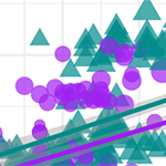
Show as much relevant data as possible, maximising the amount of information given in the smallest amount of space. This does not mean showing all of the data. Overloading a plot can lead to confusion, as seen in Figure 1. Too many variables on the same visualisation can make it less informative, hiding important messages. Multiple clearer plots, such as those in Figure 2, show the data far more clearly and make key messages easier for readers to spot.
Figure 1 (below): Scatterplot showing the size and mass of penguins in the Palmer Archipelago, Antarctica, by sex. Data taken from the palmerpenguins R package2.

Figure 2 (below): Comparisons of the size and mass of penguins on the Palmer Archipelago, Antarctica, made by sex. Data taken from the palmerpenguins R package2.

Good visualisations should reveal data on multiple levels: from a broad overview, to the finer underlying structures of the data. Employ labels and annotations to enhance the messages given by the data, drawing readers’ attention to interesting findings and the story you are trying to tell. Consider utilising preattentive attributes, which are visual characteristics that naturally draw our attention, to highlight the most important parts of a visualisation3. There are several categories of preattentive attributes that can be used:
- Spatial attributes (e.g. spatial grouping, enclosure, length, and width),
- Colour attributes (including differences in colour hue or intensity),
- Attributes of form (including size and shape).
2. Choose an appropriate design
The choice of visualisation should be driven first and foremost by the context, the audience, and the goal of the graphic. Often, people choose axes of graphics based on the data available to them. Although the choice of visualisation is influenced (and sometimes restricted) by the number and type of variables available, it should be fundamentally decided based on the message we wish to convey to the readers and the most efficient way to do this.
Unnecessary clutter and design choices that do not enhance the intended message of the visualisation should be removed from a visualisation. This includes unnecessary colours and grid markings that may distract from the data. However, do not allow the pursuit of a minimalist design that detracts from interpretation. For example, removing all grid lines on a scatterplot makes it difficult to interpret points on the graph, leaving them floating in space as shown in Figure 3. Good visualisation design requires a middle ground that ensures the data are the most important part of the graphic, whilst ensuring there is sufficient context.
Figure 3 (below): Scatterplot comparing the length of flippers and bills between species of penguins in the Palmer Archipelago, Antarctica. Data taken from the palmerpenguins R package2.

3. Maintain Data Accuracy
Data visualisations must not distort the data, nor mislead the reader. To achieve this, we must ensure that the visual representation of data is consistent with the numerical representation. One of the main obstacles of achieving this is that people perceive things differently, depending on their experience and the context3. We must be mindful of where these perceptions may interfere with the interpretation of a visualisation. For example, research shows that people’s perception of dots, lines and bars are more accurate than distinguishing between angles, proportions, and colour hues3. That is why pie charts, such as the one in Figure 4, are harder to interpret than bar charts, such as the one in Figure 5, particularly where differences between groups are small.
Figure 4 (below) : The number of crimes recorded in the East Midlands region of England in 2023, given by police force in a pie chart. Data from the UK Ministry of Justice.

Figure 5 (below): The number of crimes recorded in the East Midlands region of England in 2023, given by police force in a bar chart. Data from the UK Ministry of Justice.

This is not to say that visualisations must only contain lines and bars! Although nonstandard graphs that include curves and circles are more difficult to interpret, they have been shown to increase engagement3. If we are concerned that interpretation of a visualisation may be inhibited by differences in perceptions, we should add clear labels, titles, and annotations that help avoid ambiguity.
Another way to ensure that visualisations are clear and not misleading is adhering to the principle of proportional ink4: the amount of ink used in a visualisation should be proportional to the quantities it is representing. A common example of a violation in this principle is where a bar chart’s x-axis does not begin at 0. The differences in the lengths of bars is no longer representative of the differences between groups, leading to a distortion in the message. Figure 6 shows the same data as Figure 5, but the x-axis begins at 55,000 rather than 0. This makes the number of crimes in Lincolnshire (green) and Northamptonshire (yellow) appear smaller than they are, and exaggerates the difference between the number of recorded crimes in these areas and the others.

4. Make the visualisation accessible
Visualisations are useless if they are inaccessible and uninterpretable. We must ensure all design choices are inclusive. Some considerations when creating data visualisations:
- Text must be legible. Ensure that the font size is large enough for the purpose of the image. RSS guidelines6 recommend a font size of at least 12pt in print, or 36pt in presentations. The font family should be chosen to be accessible to those with visual impairment and learning difficulties, such as dyslexia. Arial and Verdana are often considered accessible.
- Colouring must be inclusive. Colour palettes should be chosen based on the type of data they represent. Each colour should be distinct to everyone, including those with colour-vision deficiency. A colour blindness simulator7 shows what a visualisation looks like under different types of colour blindness.
- Science should be reproducible. Where appropriate, consider making the data and code used to create visualisations open. This can be done for free using an online repository, such as Github.
> Worksheet: Watch this Video + Download Word document and Video’s PP slides.
References:
- Tufte, E. R. (2001), The Visual Display of Quantitative Information, Graphics Press , Cheshire, Connecticut .
- Horst AM, Hill AP, Gorman KB (2020). palmerpenguins: Palmer Archipelago (Antarctica) penguin data. R package version 0.1.0. https://allisonhorst.github.io/palmerpenguins/. doi: 10.5281/zenodo.3960218.
- Schwabish, J. 2021. Better Data Visualizations: A Guide for Scholars, Researchers, and Wonks. New York Chichester, West Sussex: Columbia University Press. https://doi.org/10.7312/schw19310
- Wilke, C.O., 2019. Fundamentals of data visualization: a primer on making informative and compelling figures. O'Reilly Media.
- Krause A, Rennie N, and Tarran B., (2024) Best Practices for Data Visualisation. Royal Statistical Society. doi: 10.5281/zenodo.10605197.
- “Coblis — Color Blindness Simulator.” n.d. Colblindor. Accessed July 10, 2024. https://www.color-blindness.com/coblis-color-blindness-simulator/.

About the author
Dr. Sophie Lee is a statistician and educator who teaches statistics and R coding courses to non-statisticians. Her goal is to provide accessible, engaging training that proves that statistics does not need to be scary. She has a PhD in Spatio-temporal Epidemiology from London School of Hygiene & Tropical Medicine (LSHTM) and is a Fellow of the Higher Education Academy. Her research interests lie in spatial data analysis, planetary health, and Bayesian modelling.
- Published on: 5 August 2024
- Event hosted by: Southampton
- Keywords: Data visualisation | data exploration | reproducible research | data analysis | accessibility |
- To cite this resource:
Sophie Lee. (2024). Design principles for data visualisation. National Centre for Research Methods online learning resource. Available at https://www.ncrm.ac.uk/resources/online/all/?id=20844 [accessed: 31 December 2025]
⌃BACK TO TOP